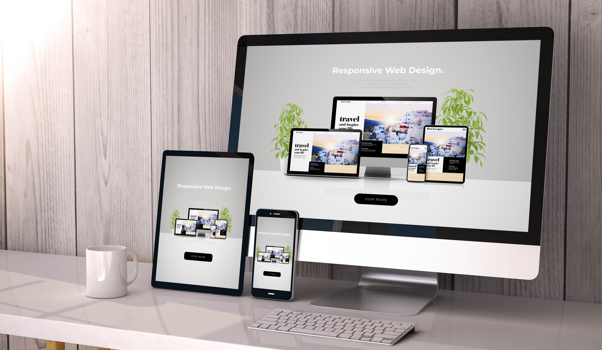
Mobile adapted website
In a mobile it must be easy!
It is not always appropriate to present the content in the same way in a large screen as in a mobile.
Sometimes pictures or other sections may be hidden in mobile view to make use easier.
This website has as an example of crazy too much content but we have a lot of content for a reason …
We make sure that your website looks and works optimally for your mobile visitors.
What is a mobile-friendly website?
A mobile-adapted website has been optimized to work well for the mobile user.
There is nothing that automatically gets good just because you make a website that looks good in larger screens.
It is important to understand how mobile use works. You may have noticed that the menu is usually hidden when the website is mobile-friendly. A good rule of thumb is to make it as simple as possible but in a way that still catches attention and looks good.
Why focus on mobile adaptation?
More than 50% of all internet users surf via mobile. In addition, mobile surfing is increasing day by day according to Google themselves, which continuously analyzes from which devices their service is used.
Because Google wants to give its users the best experience, they prioritize mobile-friendly websites first. This means that you can lose good positions on Google, which in the long run leads to fewer visits, which in turn leads to fewer leads and therefore less possible revenue.
A mobile-friendly website is more important than ever.
More customers with a mobile-friendly website
Mobile first
Since mobile usage is constantly increasing, the main focus should be on making your website easy to navigate in mobile view and then focus on larger screen sizes. However, this does not mean that you can ignore what it looks like on larger screens. What we mean is that we go from adapting for mobile view to larger screens instead of the other way around.
In web design, we call this way of working mobile first .
How much does it cost?
There is no limit to how much time you can spend on optimizing your website. In our world, a website is never ready. However, all our web production includes the degree of mobile adaptation that means that your product will work well in all mobile phones, but there is always more we can do.
Depending on what budget you have and the target group your business is primarily aimed at, we adapt accordingly.
The workspace in mobile view is much smaller than in a laptop, for example, and there is also no mouse pointer.
We have a basic rule that we adhere to when we adapt mobile – Keep it simple while the focus is on catching the visitor’s attention early.